Icons for Table on Toolbar
-
Add a New Table button
 , click this button or right click the mouse on the Table node in the Explorer window and select "Add a New Table", a window of Table Editor as shown in Figure 1 will pop out. User can create a new table by dragging and dropping the available properties in the left dialog to the right dialog as shown by the red arrow in Figure 1, and then click "OK" to generate a new table with the selected properties.
 -
Import Table from File User can import a customized table from an existing file. This can be done by choosing the command located on the menus: "Table → Import Table from File", or right click the mouse on the Table node and choose "Import Table from File" from the popup menu as shown in Figure 2. Pandat™ can read data files with ".dat" and ".txt" as default file extension names. Figure 3 shows a typical data file for importing into Pandat™. Different columns are separated by Tabs. The first row defines the data name for each column. The second row defines the unit for the data in each column and the following rows define the data values. If the column names are the same as those in the default table, the second row (the unit row) can be blank and Pandat™ will use the same units as those in the default table.
-
Create Graph button
 , create a new graph for the selected properties. Use the <Ctrl> key and the left button of the mouse to select multiple columns in the table as shown in Figure 4. The first selected column is set as the abscissa (x-axis), and the other columns are set to be the ordinate (y-axis). After click on the button , a graph will then be generated in the Pandat™ main display window as shown in Figure 5.
 -
Create Color Map button
 , create a new color map graph for the selected properties. Use the <Ctrl> key and the left button of the mouse to select multiple columns in the table as shown in Figure 6. The first selected column x(Mg) is set as the abscissa (x-axis), the second column x(Zn) is set as the ordinate (y-axis), the value of the third column T will be displayed as color map in a 2D plot. After click on the button, a color map graph will then be generated in the Pandat™ main display window as shown in Figure 7, where the liquidus temperatures are represented by different colors.
 -
Create 3D Surface Graph button
 , create a new 3D surface graph for the selected properties. Use the <Ctrl> key and the left button of the mouse to select multiple columns in the table as shown in Figure 6. The first selected column is set as the x-axis, the second column is set as the y-axis, and the third column is set to be the z-axis for the new plot. After click on the button , a 3D liquidus surface graph will then be generated in the Pandat™ main display window as shown in Figure 8.
 -
Create 3D Graph button
 , create a new 3D graph for the selected properties. Use the <Ctrl> key and the left button of the mouse to select multiple columns in the table as shown in Figure 6. The first selected column is set as the x-axis, the second column is set as the y-axis, and the third column is set to be the z-axis for the new plot. After click on the button , a 3D graph will then be generated in the Pandat™ main display window as shown in Figure 9 representing the monovariant lines of the liquidus projection.
 -
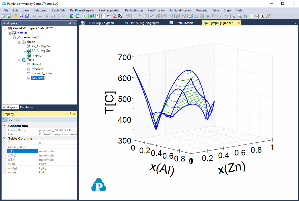
User can add more plots to the 3D graph. First click on the table containing the data, i.e. isotherm data in Figure 10, and the property window will show the column names in this table. Then select the column "x(Al)" as x-axis in the property window, drag and drop it to the graph; then hold the <Ctrl> key and select the second column "x(Zn)" as y-axis, drag and drop it to the graph; and then hold the <Shift> key, select the third column "T", drag and drop it to the graph. The new plot of the data will be added to the original 3D graph shown as Figure 11.
-
Export to Excel button
 allow user to export the table data directly to a Microsoft Excel file, when the table is open in the main display windows to activate this function. Excel must be pre-installed in the user’s computer.
 -
Export to a Text File: From the menu "Table → Export to a Text File", user can export the table data to .dat or .txt file.
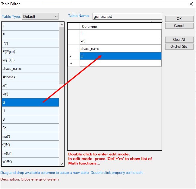
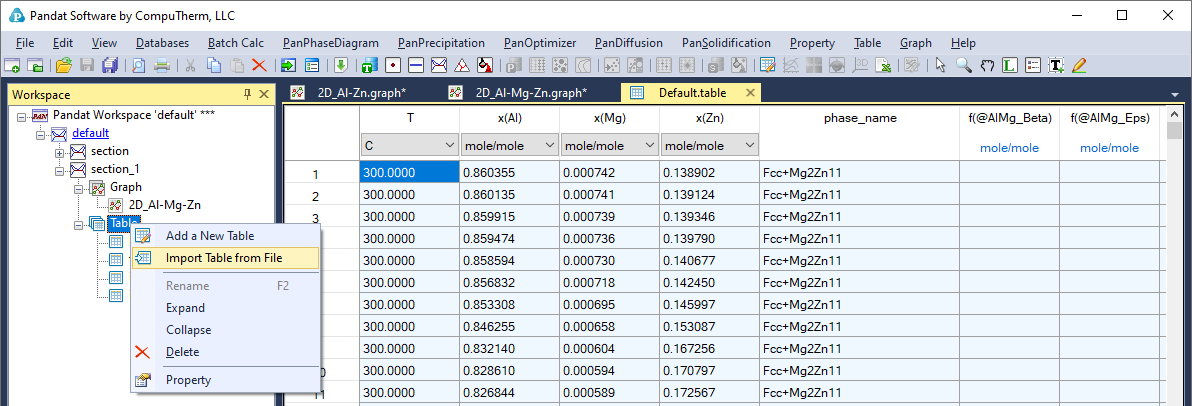
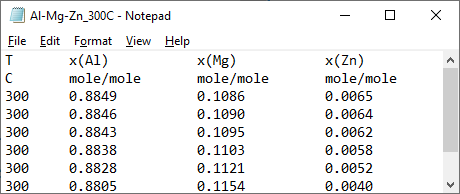
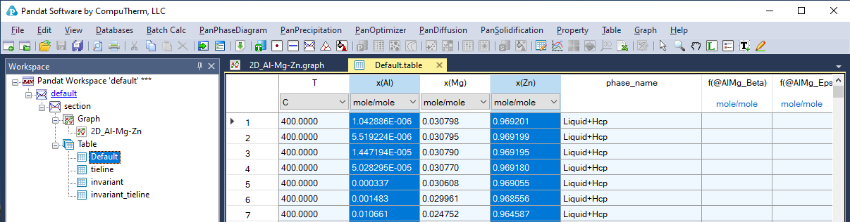
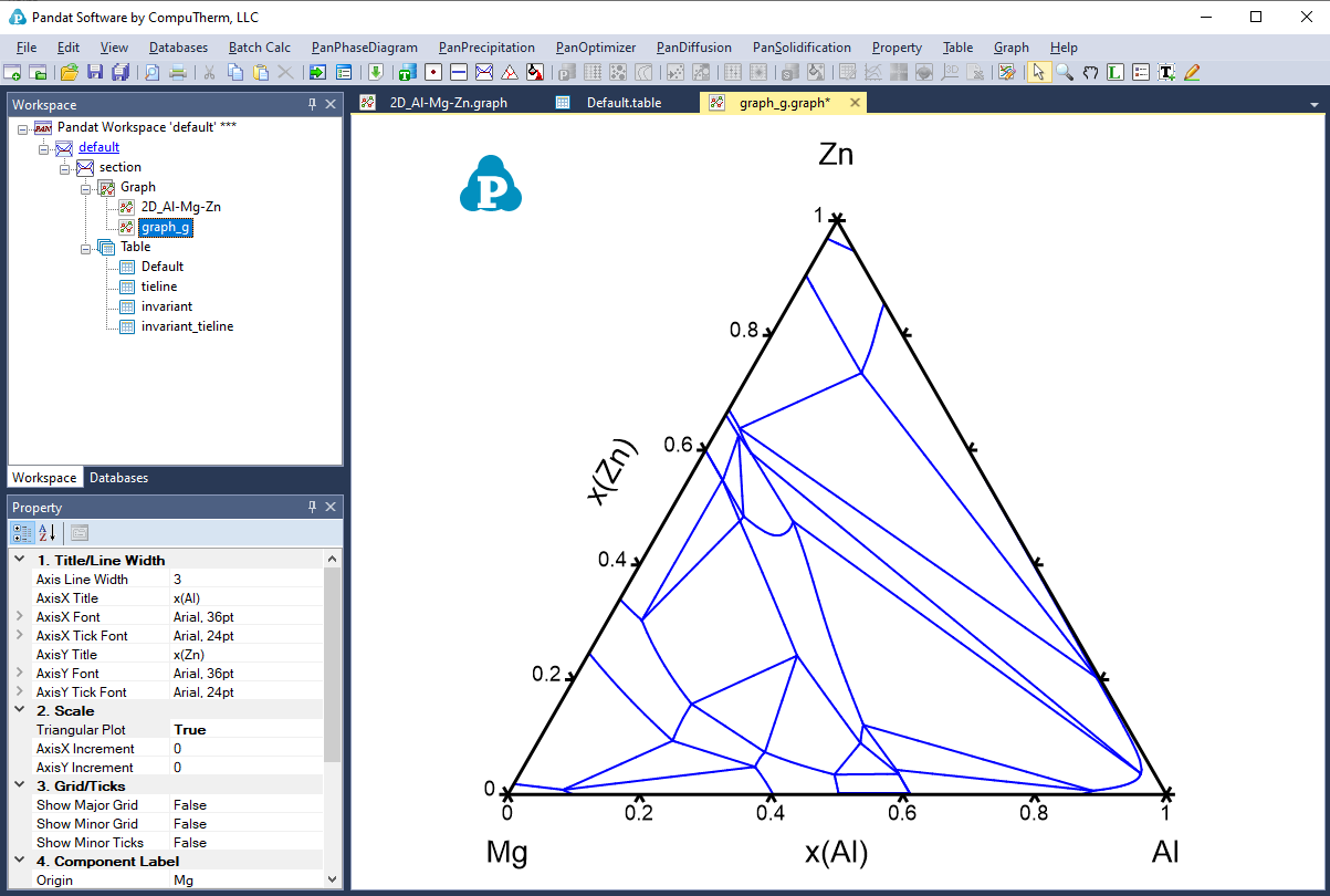
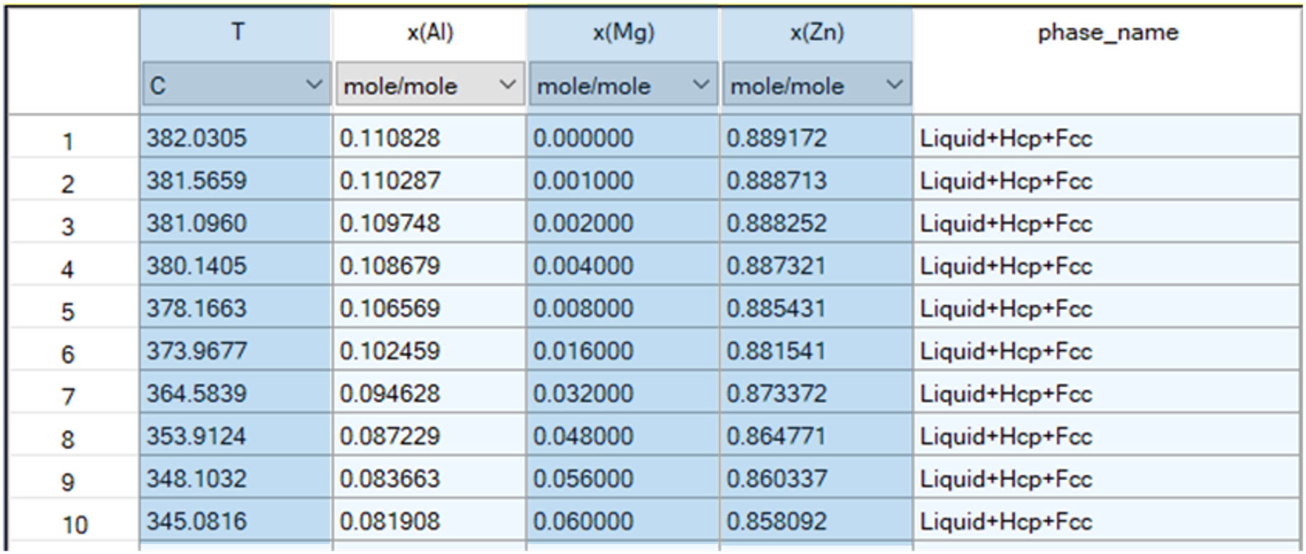
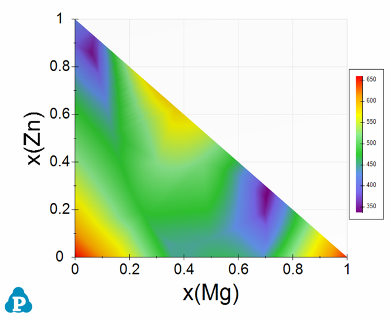
Figure 7: A new color map graph created from selected columns in the isotherm table from the liquidus projection calculation
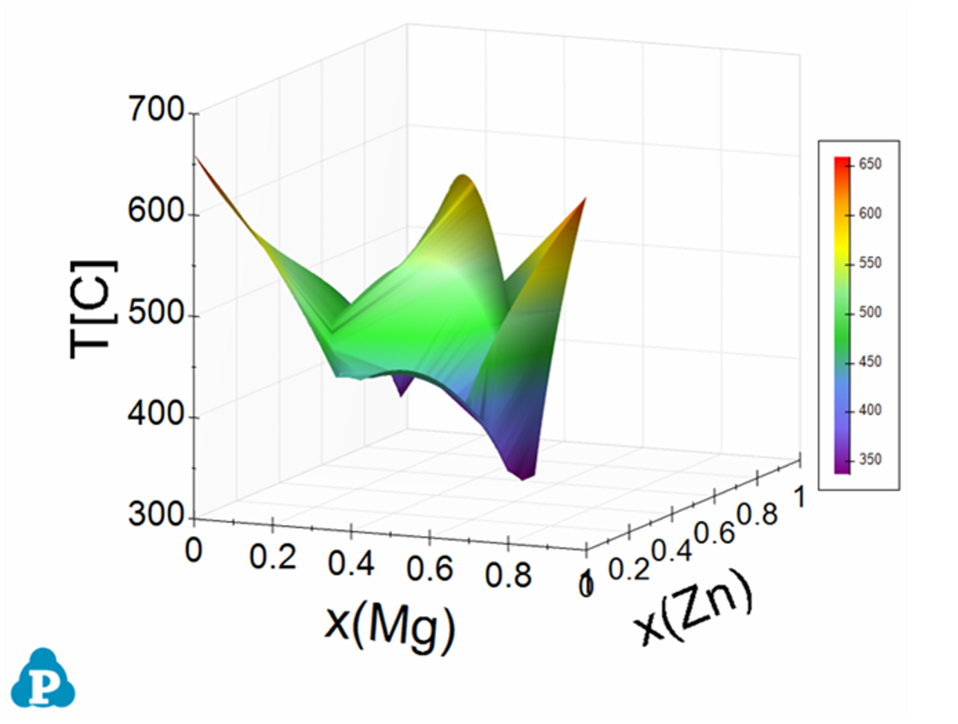
Figure 8: A new 3D liquidus surface graph created from selected columns in the isotherm table from the liquidus projection calculation
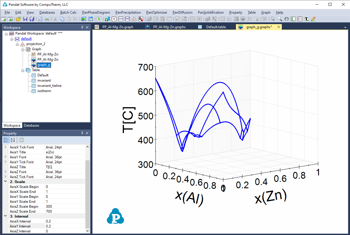
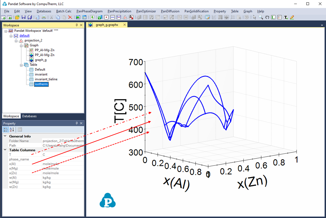
Figure 10: Add a plot to a 3D graph using selected columns in the table as follows: (1) Solid arrow: drag and drop, (2) Dash arrow: drag and drop with the <Ctrl> key held, (3) Dash dot arrow: drag and drop with the <Shift> key held